Joify ice cream

A full-system brand identity, packaging, and website design for a new-generation Indian ice cream brand going up against the legacy giants — without trying to become one.

A full-system brand identity, packaging, and website design for a new-generation Indian ice cream brand going up against the legacy giants — without trying to become one.

my role
my role
my role
my role

visual Designer

visual Designer

visual Designer
visual Designer
CAtegory
CAtegory
CAtegory
CAtegory

Brand · Packaging · Website

Brand · Packaging · Website

Brand · Packaging · Website
timeline
timeline
timeline
timeline

9 weeks

9 weeks

9 weeks
9 weeks

The Problem

The Problem

A market where everyone looks the same
India's ice cream shelf is dominated by brands built on nostalgia, scale, and discount signalling. The visual language is predictable: bright primaries, generic type, flavour photography that all starts to blur. Joify had the product quality to compete with anyone — but the brand couldn't communicate that.

The challenge wasn't to shout louder. It was to look different in a way that felt earned. Youth-friendly but not juvenile. Visually loud but emotionally warm. Bold enough to stand out on a freezer shelf, and trustworthy enough to convince a distributor to stake shelf space on it.

The homepage was designed to be a gateway to all content on the platform. We focused on clarity, accessibility, and visual appeal:


  • Segmented Blog Categories: Organized by type (news, guides, reviews) for easy navigation.

  • Trending Headlines Ticker: Instantly informs users about the hottest topics in tech.

  • Product Grids: Featured cover images, blog titles, post dates, and read times for user clarity.

  • Search Functionality: A robust search bar allows users to quickly find topics of interest.


We used a vibrant color palette and bold typography to create a modern, high-energy vibe that appeals to tech enthusiasts. The homepage is both inviting and functional, encouraging users to explore the platform.

Audience Strategy

Audience Strategy

The audience mapping revealed a layered ecosystem — kids as emotional entry points, teens as the coolness arbiters, families as the actual purchasers, and distributors as the business gatekeepers. Each segment has different expectations of the same website.

The homepage was designed to be a gateway to all content on the platform. We focused on clarity, accessibility, and visual appeal:


  • Segmented Blog Categories: Organized by type (news, guides, reviews) for easy navigation.

  • Trending Headlines Ticker: Instantly informs users about the hottest topics in tech.

  • Product Grids: Featured cover images, blog titles, post dates, and read times for user clarity.

  • Search Functionality: A robust search bar allows users to quickly find topics of interest.


We used a vibrant color palette and bold typography to create a modern, high-energy vibe that appeals to tech enthusiasts. The homepage is both inviting and functional, encouraging users to explore the platform.

Brand Identity

Brand Identity

The Joify wordmark uses a custom retro-playful typeface with deliberate bounce and weight variation — it reads as fun without reading as cheap. Paired with the tagline "real ice cream," the lockup does the heavy lifting of both brand positioning and quality signalling in one visual unit.

The identity was defined by what Joify is not as much as what it is. Not a boring FMCG brand. Not a discount dessert label. Not just another ice cream company. The non-negotiables: bold, colourful, unapologetically fun — without ever being childish.

The page was structured to maximize readability and encourage users to explore further. Every element was designed to support the client’s affiliate marketing goals.


  • "In This Blog" Section: Featured at the very start, it includes a table of contents with affiliate links to the products mentioned in the blog. This allows users to decide whether the content is relevant to their needs and provides direct access to products.


  • CMS Integration: A dynamic CMS was built to handle blog content efficiently, ensuring easy updates and a seamless connection between the blog database and the front end.

Packaging Design

Packaging Design

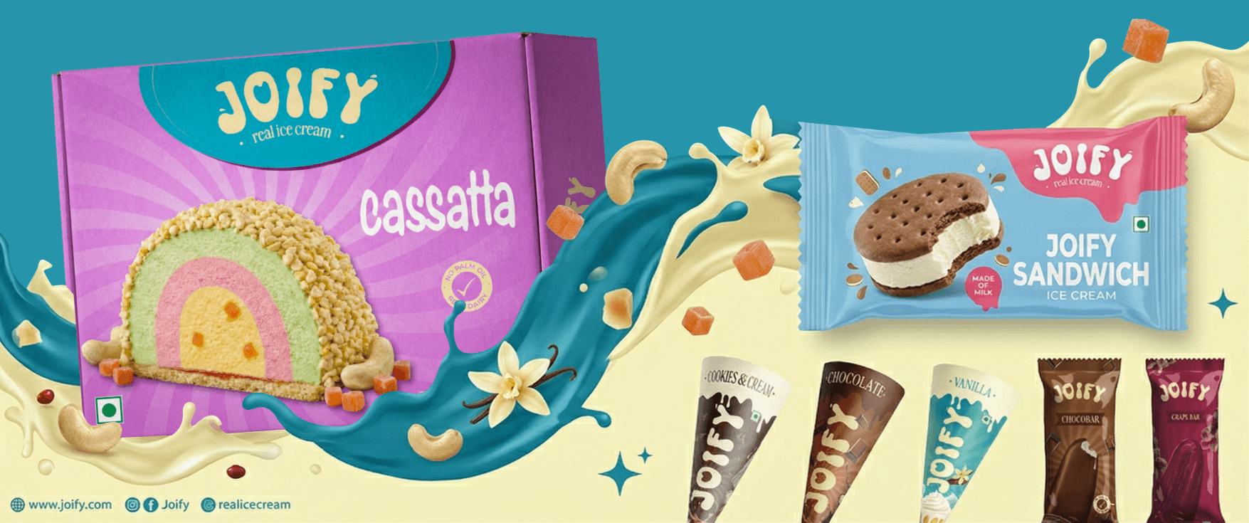
The packaging system spans the full product range — tubs, bars, cones, cups, cassattas, and specialty items. Each format uses a consistent structural logic: the Joify wordmark dominant, flavour name bold at the base, and the scoop photograph as the emotional hero.

The centrepiece decision was the burst / sunray background — a retro device that feels simultaneously nostalgic and new, and immediately differentiates Joify on a freezer shelf against flat or gradient-heavy competitors.

The page was structured to maximize readability and encourage users to explore further. Every element was designed to support the client’s affiliate marketing goals.


  • "In This Blog" Section: Featured at the very start, it includes a table of contents with affiliate links to the products mentioned in the blog. This allows users to decide whether the content is relevant to their needs and provides direct access to products.


  • CMS Integration: A dynamic CMS was built to handle blog content efficiently, ensuring easy updates and a seamless connection between the blog database and the front end.

Colour System

Colour System

The most unconventional decision in the system: instead of a fixed brand palette, each flavour owns its own colour world. The website adapts its mood based on what you're exploring. Chocolate → Cocoa Brown. Vanilla → Cool Teal. Strawberry → Berry Pink. Mango → Saffron Olive.

This creates a site that feels alive and responsive — not one rigid palette applied uniformly across every page. The packaging colours were derived first, and the digital system then mirrors those tones exactly, ensuring continuity from shelf to screen to memory.

The page was structured to maximize readability and encourage users to explore further. Every element was designed to support the client’s affiliate marketing goals.


  • "In This Blog" Section: Featured at the very start, it includes a table of contents with affiliate links to the products mentioned in the blog. This allows users to decide whether the content is relevant to their needs and provides direct access to products.


  • CMS Integration: A dynamic CMS was built to handle blog content efficiently, ensuring easy updates and a seamless connection between the blog database and the front end.

Visual Language System

Visual Language System

The visual language system defines every shape, motion principle, and section transition on the site. The guiding principle: everything exists to make the experience feel smooth, joyful, and intentional — never noisy or chaotic.

Core shapes include the Blob (soft, organic — representing creaminess), Wave Separator (section transitions only, mimicking melting), Scoop Circle (product emphasis), and Drip Edge (sparingly, for movement and indulgence). Motion is slow, calming, and almost subconscious — if you notice the animation more than the content, it's too much.

Website Design

Website Design

The Joify website was designed Framer-first for a fast, lightweight build. The core non-negotiable: even with high-drama visuals — cold vapour, condensation, melting edges — the product pack and scoop must be the first thing the eye finds on every fold. Visual effects support the product; they never compete with it.

The hero section opens with "Full Cream. Full Scene." — a line that earns its real-ice-cream credentials in four words. The page flows through Category Universe (large flavour cards that feel like freezer doors opening), Flavour Spotlight (horizontal scroll showcase), Why Joify, Store Locator, and a Distributor CTA — each section designed for a different audience's goal.

In-Store & Print

In-Store & Print

The identity extended into retail touchpoints — a menu board system using blob-shaped category containers, bold product photography, and flavour-coded backgrounds that match the packaging. The in-store display is designed for fast reading and impulse buying, not for slow browsing.

Outcome

Outcome

Joify went from a product with no visual identity to a brand with a fully documented, scalable design system — one that could be handed to any designer, developer, or print vendor and executed consistently.

The flavour-led colour system, in particular, solves a problem most FMCG brands never attempt: giving each product its own emotional world without fragmenting the overall brand. The result is a website that feels alive rather than templated — and packaging that earns attention on a freezer shelf without discounting to get it.

  • More Works More Works

Taxi

Samsung Keyboards

UX Enhancement

Taxi

Samsung Keyboards

UX Enhancement

Taxi

Samsung Keyboards

UX Enhancement

Woman

Athlabs Branding

Branding & Packaging

Woman

Athlabs Branding

Branding & Packaging

Woman

Athlabs Branding

Branding & Packaging

Motorcycle

Nutrabay App

Product Redesign

Motorcycle

Nutrabay App

Product Redesign

Motorcycle

Nutrabay App

Product Redesign

Basketball

Nutrabay Admin Panel

Supplement Marketplace

Basketball

Nutrabay Admin Panel

Supplement Marketplace

Basketball

Nutrabay Admin Panel

Supplement Marketplace

Let'S WORK

TOGETHER

Man
BASED IN india, I AM AN INNOVATIVE DESIGNER AND DIGITAL ARTIST. MY
PASSION FOR MINIMALIST AESTHETICS, ELEGANT TYPOGRAPHY, AND
INTUITIVE DESIGN IS EVIDENT IN MY WORK.

Let'S WORK

TOGETHER

Man
BASED IN india, I AM AN INNOVATIVE DESIGNER AND DIGITAL ARTIST. MY
PASSION FOR MINIMALIST AESTHETICS, ELEGANT TYPOGRAPHY, AND
INTUITIVE DESIGN IS EVIDENT IN MY WORK.

Let'S WORK

TOGETHER

Man
BASED IN india, I AM AN INNOVATIVE DESIGNER AND DIGITAL ARTIST. MY PASSION FOR MINIMALIST AESTHETICS, ELEGANT TYPOGRAPHY, AND INTUITIVE DESIGN IS EVIDENT IN MY WORK.

Let'S WORK

TOGETHER

Man
BASED IN india, I AM AN INNOVATIVE DESIGNER AND DIGITAL ARTIST. MY PASSION FOR MINIMALIST AESTHETICS, ELEGANT TYPOGRAPHY, AND INTUITIVE DESIGN IS EVIDENT IN MY WORK.

Create a free website with Framer, the website builder loved by startups, designers and agencies.